Wanderlust Nutrition
Wanderlust Nutrition
OUTDOORSY | HEALTHY | CLEAN
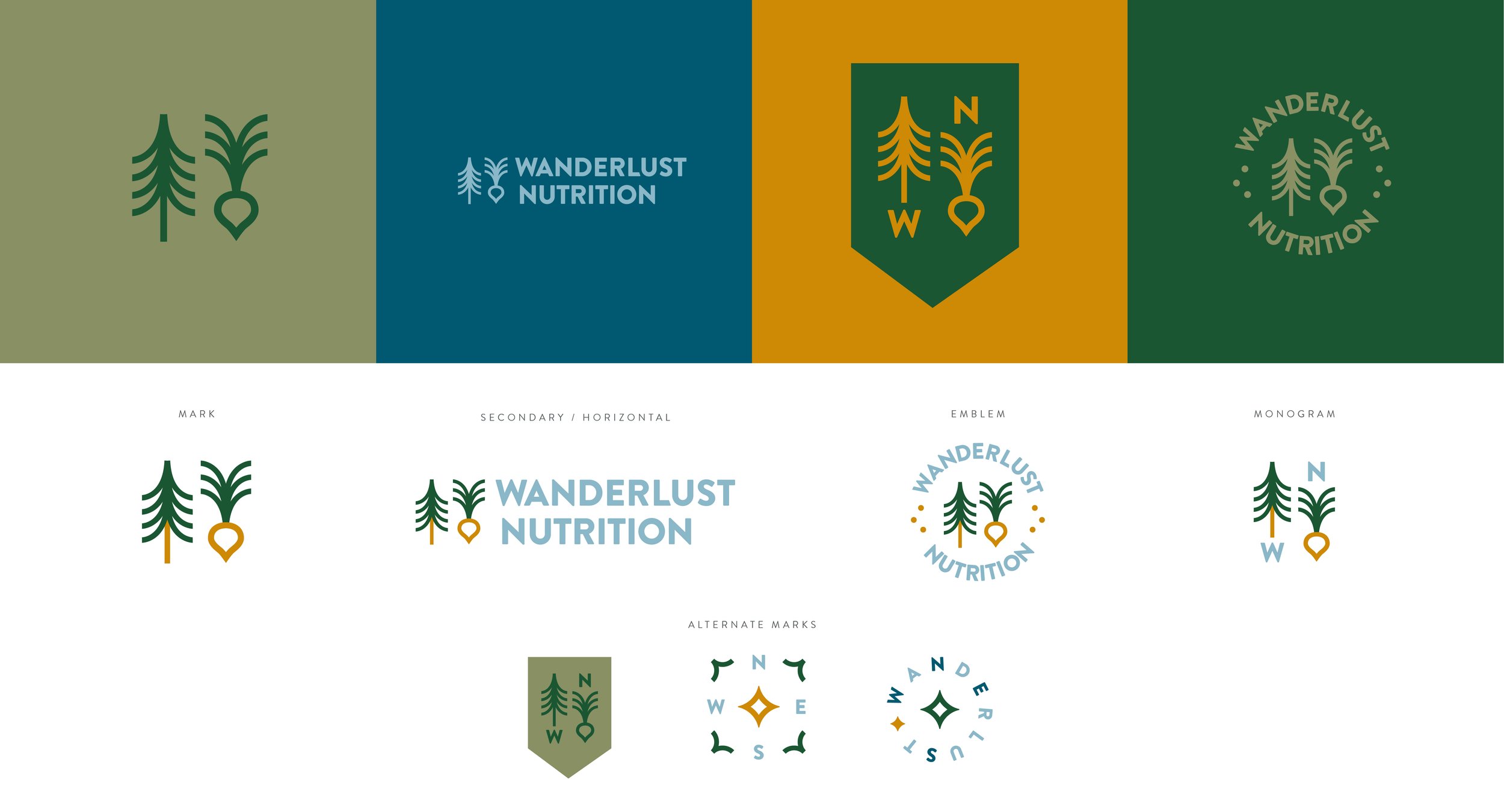
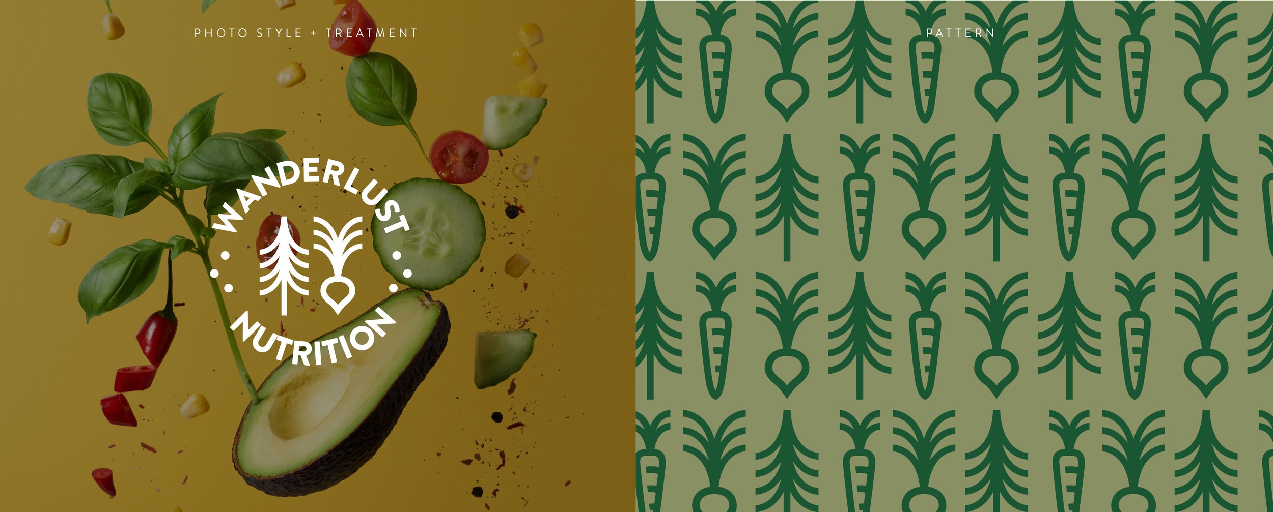
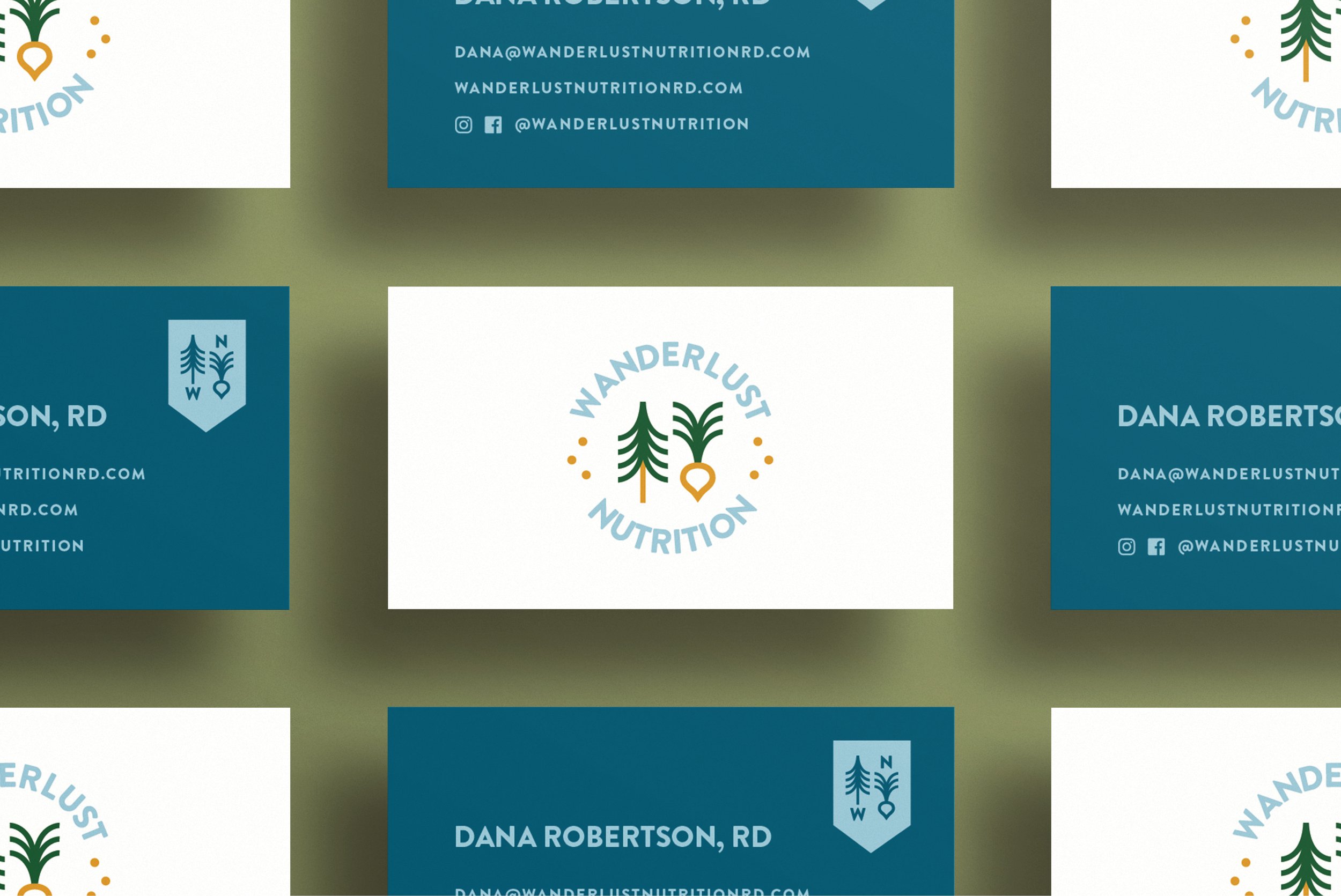
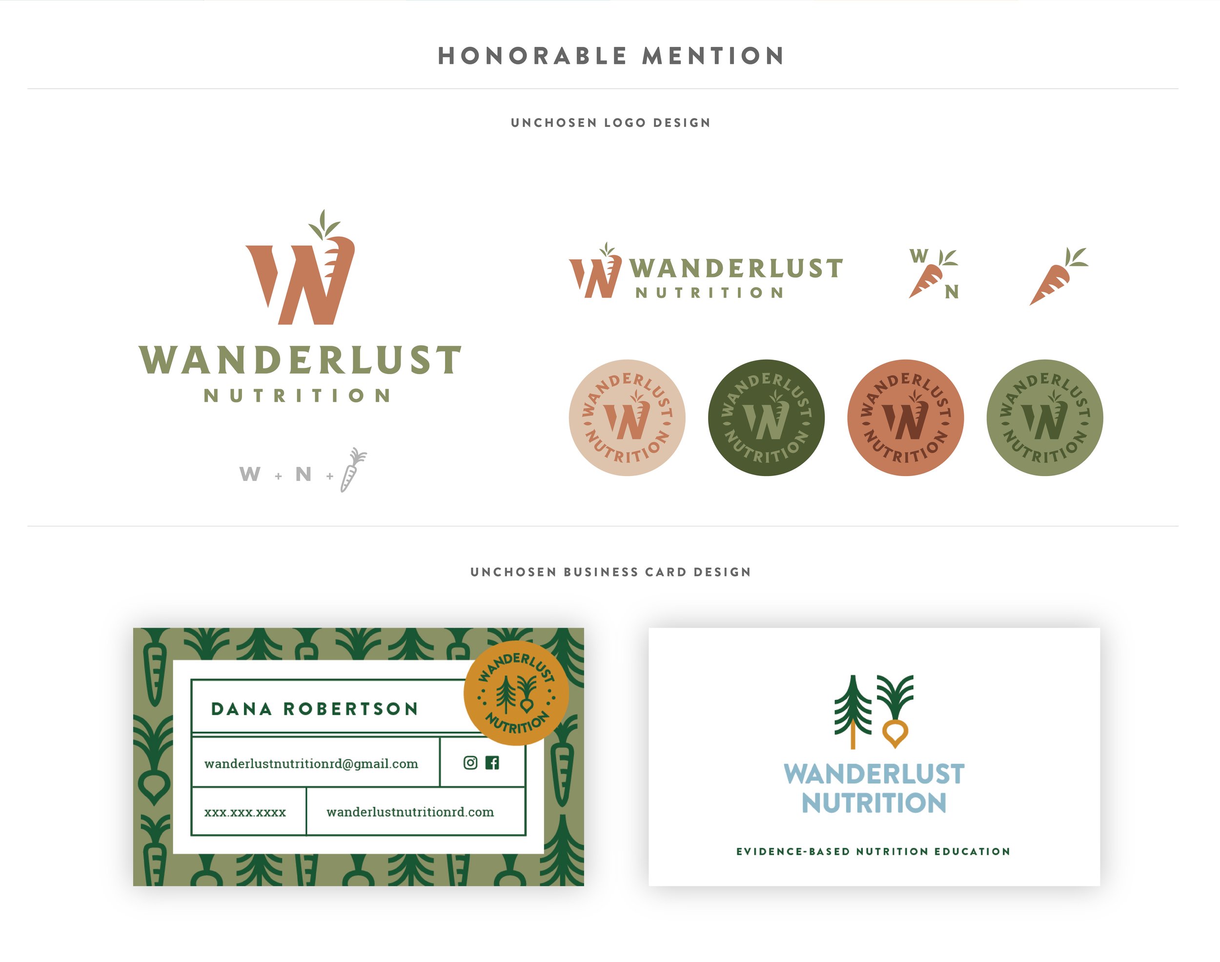
This concept is really clean and straightforward. I thought of this one almost like a “back-to-basics’ approach. It’s very clean with outdoorsy and healthy elements. The simple shapes and lines form a tree and a root vegetable. The clean, simplified approach can be synonymous with wanderlust and camping outdoors – the simple act of cooking food over a fire is getting back to the basics of meal preparation. Therefore, this design is clean, simple, and leans into a camping and wanderlust approach. The camping concept is portrayed through the badge-like emblems, and using letters in “wanderlust” to signify a compass for example: W - west, N - north, and WaNdErluSt (WNES - west north east south), the basic direction of a journey.
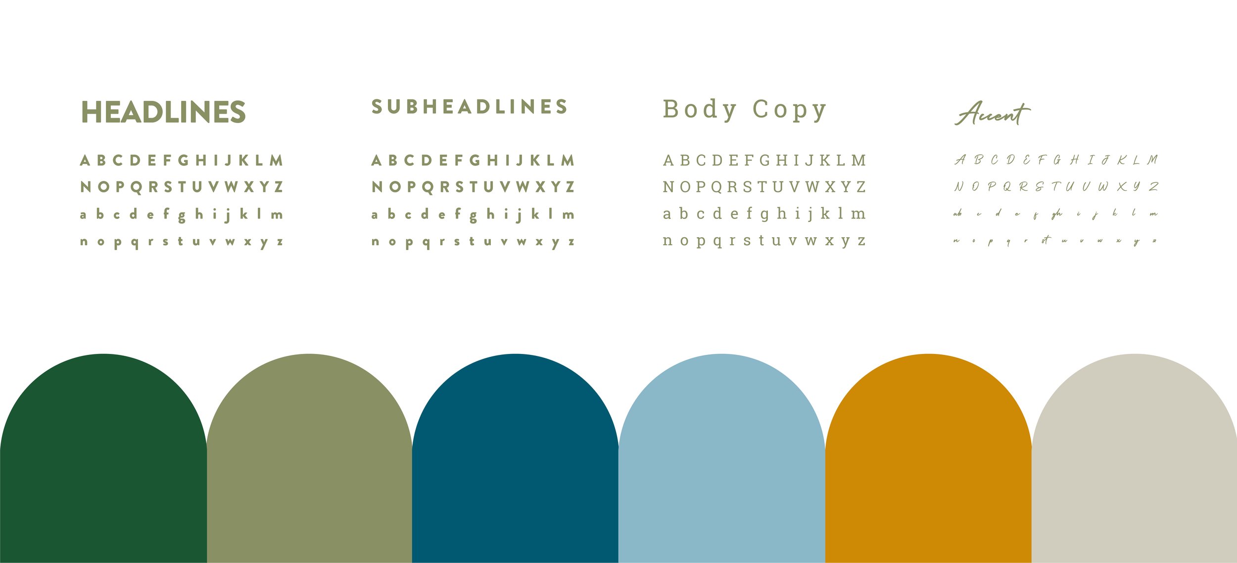
The typography is simple and clean to compliment the lines in the mark.
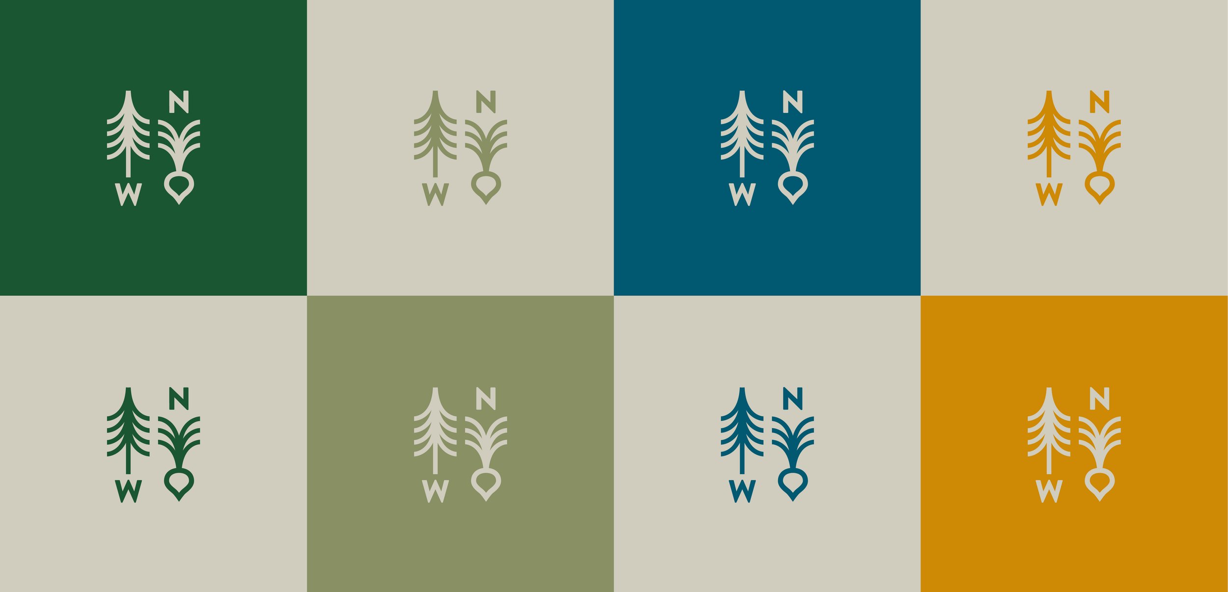
The colors are bright, yet not too bold, and tie back into nature and the feeling of a tranquil morning.
Design Services
Brand development
Logo identity
Collateral


