Hey We Should Talk
Hey We Should Talk
Hey We Should Talk shares meaningful stories, one conversation at a time. “The simple premise of Hey We Should Talk is to celebrate the things that you’re passionate about.”
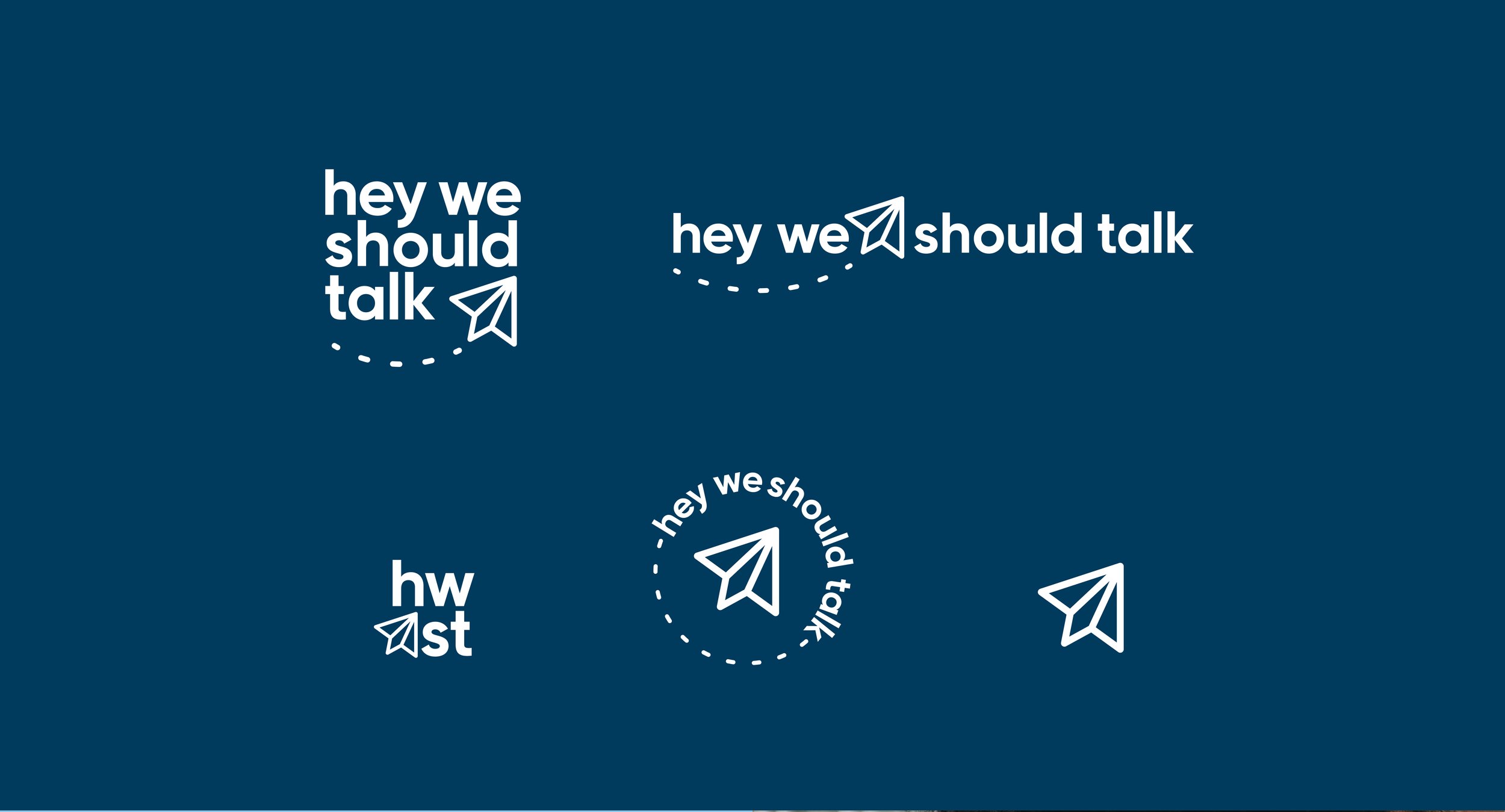
The inspiration behind this concept is based on a physical form of sharing stories. This is represented best when writing a note or letter and passing it to a friend. A fun take on this, is sending a paper airplane note, which is where the visual identity comes into play.
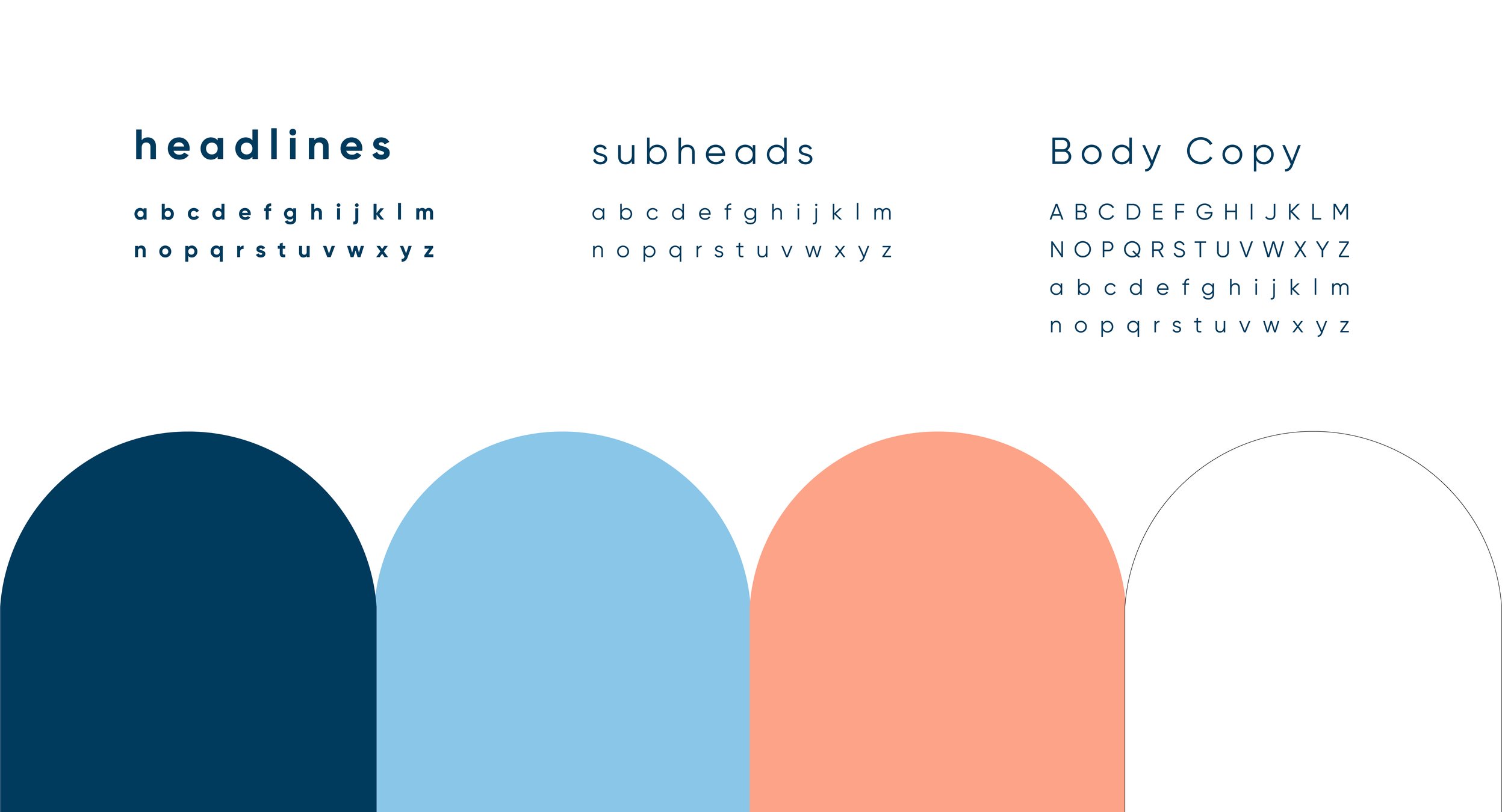
The primary typography in this design is an all lowercase sans serif. It’s very fun, yet clean. Using all lowercase letters feels a bit informal - similar to writing a note or letter.
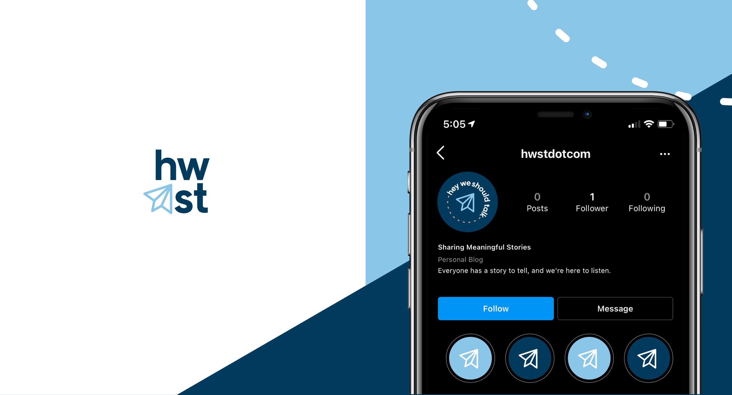
Navy: Communicates honesty and loyalty. It also grounds the design. Light blue: Communicates youth and peace. Using a light blue also balances the design. Coral: Communicates energy and a warm approach -- adding another level of connectivity to the audience.
Design Services
Brand development
Logo identity
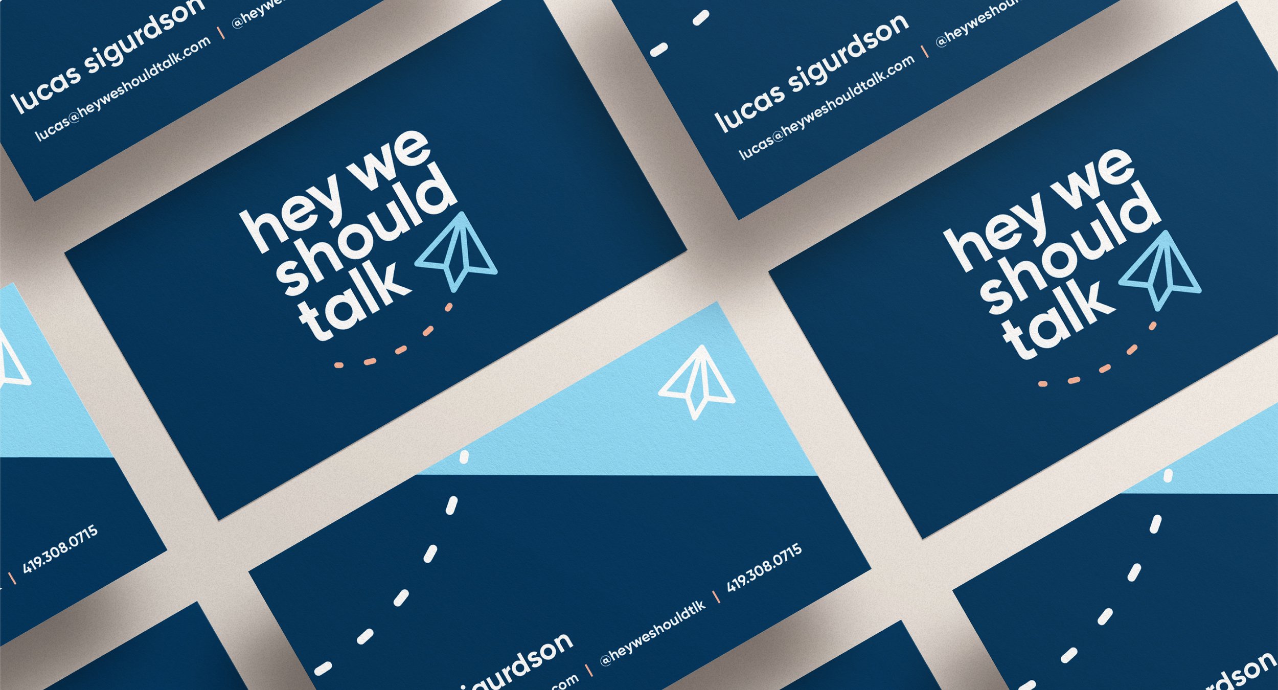
Collateral

