Synergy Engagement
Synergy Engagement
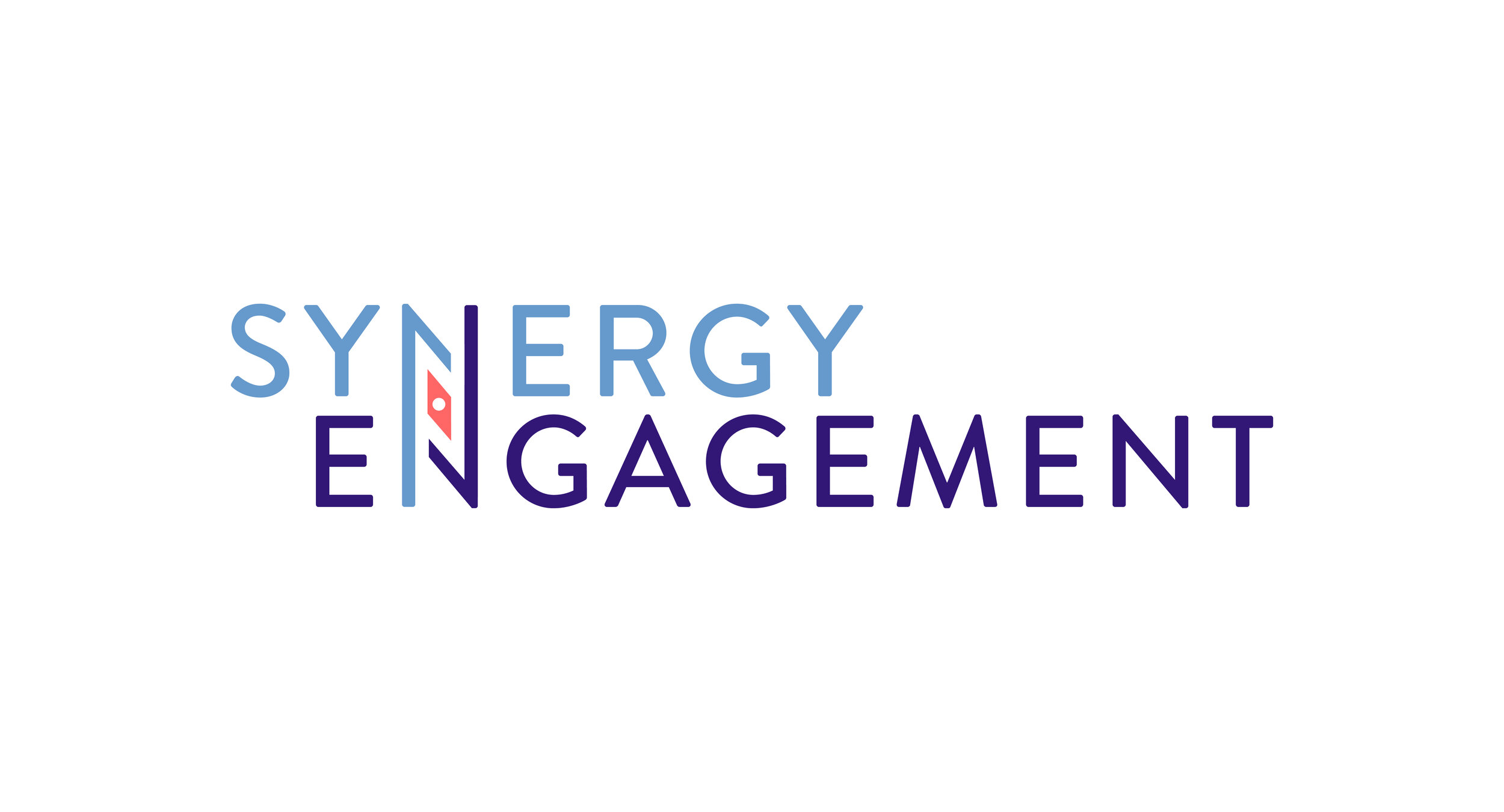
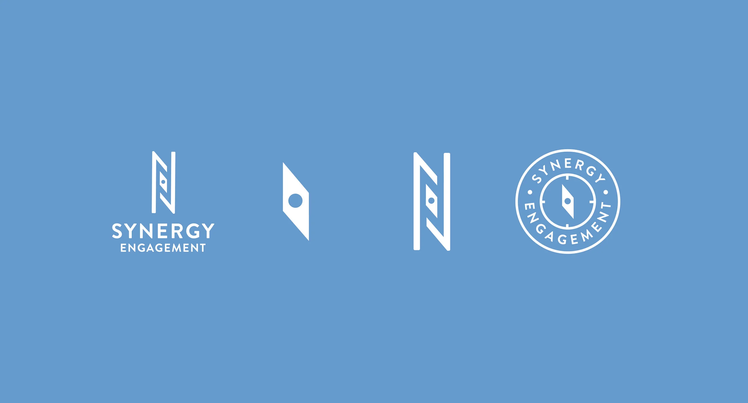
Synergy Engagement helps navigate crisis and communications strategies for their clients. The way the N’s work together in this primary logo represent the synergy that this company has when working with their clients in times of crisis or navigating public relations situations. The compass needle between the N’s also signifies how Synergy Engagement helps navigate clients through uncharted waters by communicating effectively and efficiently. The way the words come together nods back to the definition of synergy.
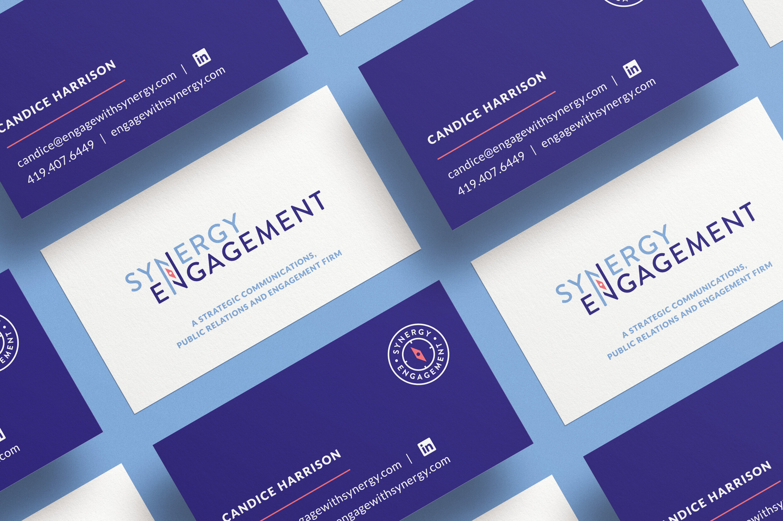
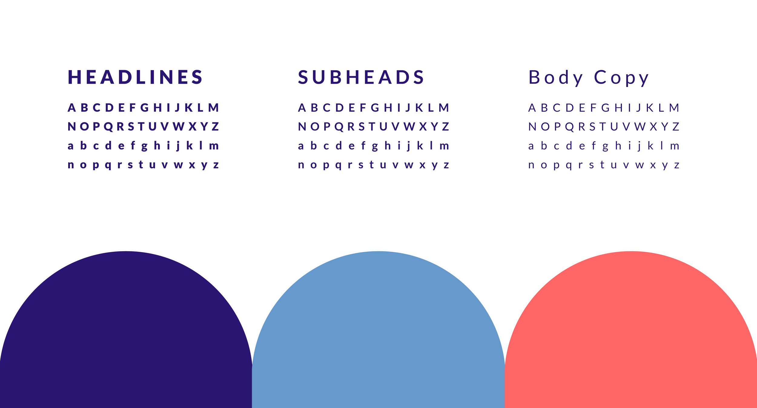
The color palette is calming and peaceful. Indigo grounds the design with strength and stability. The contrast of the light blue communicates a calming effect. Coral communicates the alarming aspect of crisis management , matched with the gentle approach of working with clients on a solution. The coral also represents the woman-owned company aspect. The lettering style is bold, soft, and clean to ground the design and portray confidence.
DESIGN Services
Brand development
Logo identity
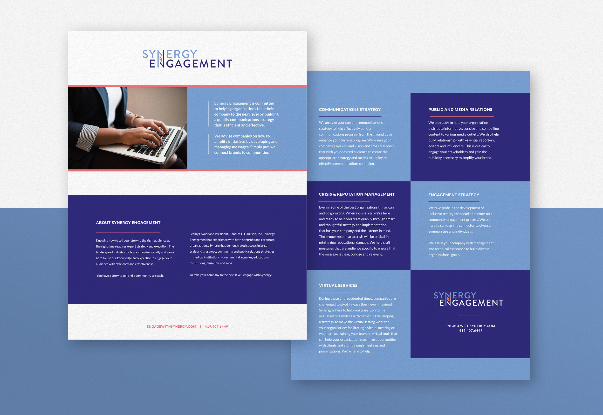
Print collateral

